Modern vs Classic Font Styles: When to Use Each

Typography is one of the most powerful tools in design, influencing how messages are perceived and creating a visual identity for brands, products, and content. Among the many decisions designers face, choosing between modern and classic font styles is crucial. Each style carries its own personality, readability factors, and use cases. Understanding the differences and knowing when to use each can elevate both digital and print designs, ensuring clarity, aesthetics, and emotional impact.
Understanding Classic Font Styles
Characteristics of Classic Fonts
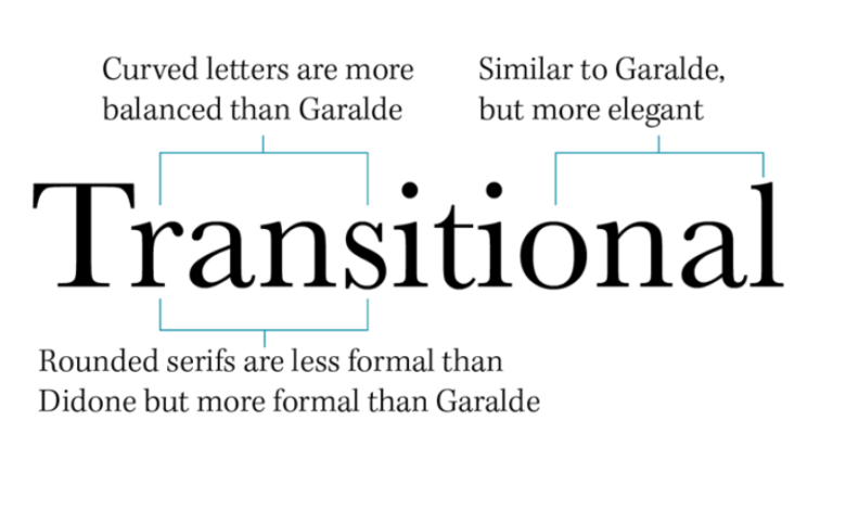
Classic fonts, often referred to as traditional or serif fonts, have been used for centuries in print and digital media. Their defining feature is the small strokes or “serifs” at the ends of letters. These subtle details guide the reader’s eyes along lines of text, improving readability in long passages. Classic fonts are typically elegant, refined, and timeless, making them ideal for conveying authority, trustworthiness, and sophistication.
See also: The Technology Behind Barcode Scanners: How They Revolutionized Data Capture
Common Uses for Classic Fonts
Classic fonts excel in applications where a sense of tradition, reliability, or professionalism is desired:
- Printed Books and Magazines: Serif fonts like Times New Roman or Garamond are preferred for body text because they enhance reading comfort.
- Corporate Branding: Many law firms, banks, and consulting companies use classic fonts to communicate credibility and stability.
- Formal Invitations and Certificates: Their elegance lends a sense of ceremony and refinement to printed materials.
Benefits of Classic Fonts
Classic fonts enhance readability in dense text, provide a sense of credibility, and give designs a timeless appeal. They are ideal when the goal is to communicate reliability and professionalism.
Understanding Modern Font Styles
Characteristics of Modern Fonts
Modern fonts, often represented by sans-serif designs, are clean, minimal, and geometric. They lack the small strokes at the ends of letters, creating a sleek and contemporary appearance. Modern fonts convey clarity, innovation, and simplicity, making them suitable for digital interfaces, advertisements, and progressive brands.
Common Uses for Modern Fonts
Modern fonts are ideal in contexts where readability on screens, minimalism, and a contemporary aesthetic are priorities:
- Websites and Mobile Apps: Fonts like Helvetica, Open Sans, or TT Norms® Pro maintain legibility across devices and screen sizes.
- Tech and Startups: Brands that want to appear innovative, approachable, or forward-thinking often adopt modern fonts.
- Marketing and Social Media: Clean lines and simple shapes help messages pop in ads, banners, and posts.
Benefits of Modern Fonts
Modern fonts are versatile, easy to read on digital platforms, and convey a sense of progressiveness and modernity. They suit designs that need to appear fresh, approachable, and forward-looking.
Choosing Between Modern and Classic Fonts
Consider the Audience
Your target audience should influence font selection. Older or more traditional audiences may respond better to classic fonts, while younger, tech-savvy audiences might prefer modern, minimal designs.
Match the Brand Personality
Brands have personalities, and fonts must reflect that. Classic fonts suit brands emphasizing heritage, trust, and sophistication. Modern fonts align with brands focusing on innovation, simplicity, and user-centered design.
Evaluate the Medium
The medium also plays a significant role. Print materials often benefit from classic fonts for extended reading, while digital platforms require modern fonts optimized for clarity on screens. Combining styles can also work—using classic fonts for headings in printed brochures and modern fonts for subheadings or captions.
Maintain Readability
Regardless of style, readability should always be a priority. Consider font size, weight, and spacing to ensure the text is comfortable to read. Overly decorative classic fonts or ultra-thin modern fonts can hinder comprehension if misused.
Conclusion
Modern and classic font styles each have distinct strengths, personalities, and use cases. Classic fonts bring tradition, elegance, and authority, making them ideal for formal and professional contexts. Modern fonts offer clarity, simplicity, and a contemporary feel, perfect for digital interfaces, branding, and marketing. By understanding their characteristics and thoughtfully applying them according to audience, brand identity, and medium, designers can create visually compelling, readable, and effective designs. The key is to balance aesthetics with function, ensuring that every font choice enhances communication and resonates with the intended audience.


